
Power BI Built for Clinical Operations
Unlock Actionable Insights from Your Trial Data with PowerGraph & Power BI
Stop wrestling with complex spreadsheets and static reports. PowerGraph provides expert data modeling, custom Power BI reporting, and specialized visuals designed specifically for the demands of clinical trials.
Powering Success For


THE CHALLENGE
Clinical Trial Reporting Is Uniquely Complex
Clinical data lives across disconnected systems — EDC platforms, CTMS, lab databases, and sponsor portals — each with its own format and update cadence. Standard BI tools weren't built for this environment, leaving teams with static exports, manual reconciliation, and reports that are outdated before they're shared.
Disparate Data Formats
EDC, CTMS, and lab systems each export data differently, making unified analysis a manual, error-prone process.
Inconsistent Reporting Standards
Without a single source of truth, sponsor and site reports diverge — creating reconciliation overhead and eroding stakeholder confidence.
No Real-Time Visibility
Static exports go stale the moment they're generated. Study teams need live dashboards, not yesterday's snapshot.
Our Clinical Trial Data Solutions
Custom Power BI Reports and Specialized Visuals

Data Architecture & Modeling
Connect and unify your trial data from EDC, CTMS, and lab systems into a single reliable source of truth. We build the backend infrastructure that makes accurate, real-time reporting possible.

Custom Power BI Dashboards
Go beyond static reports with interactive dashboards built specifically for clinical operations. Track enrollment, site activity, patient disposition, and study milestones in one place.

Specialized Clinical Visuals
Our Gantt timelines, Swimmer plots, and Sankey diagrams are designed for the unique demands of clinical trials. Drop them directly into your Power BI environment for instant clarity.
Featured Clinical Visuals
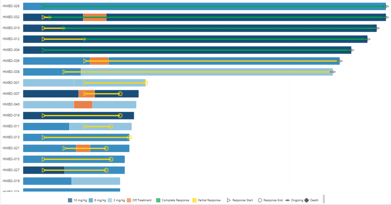
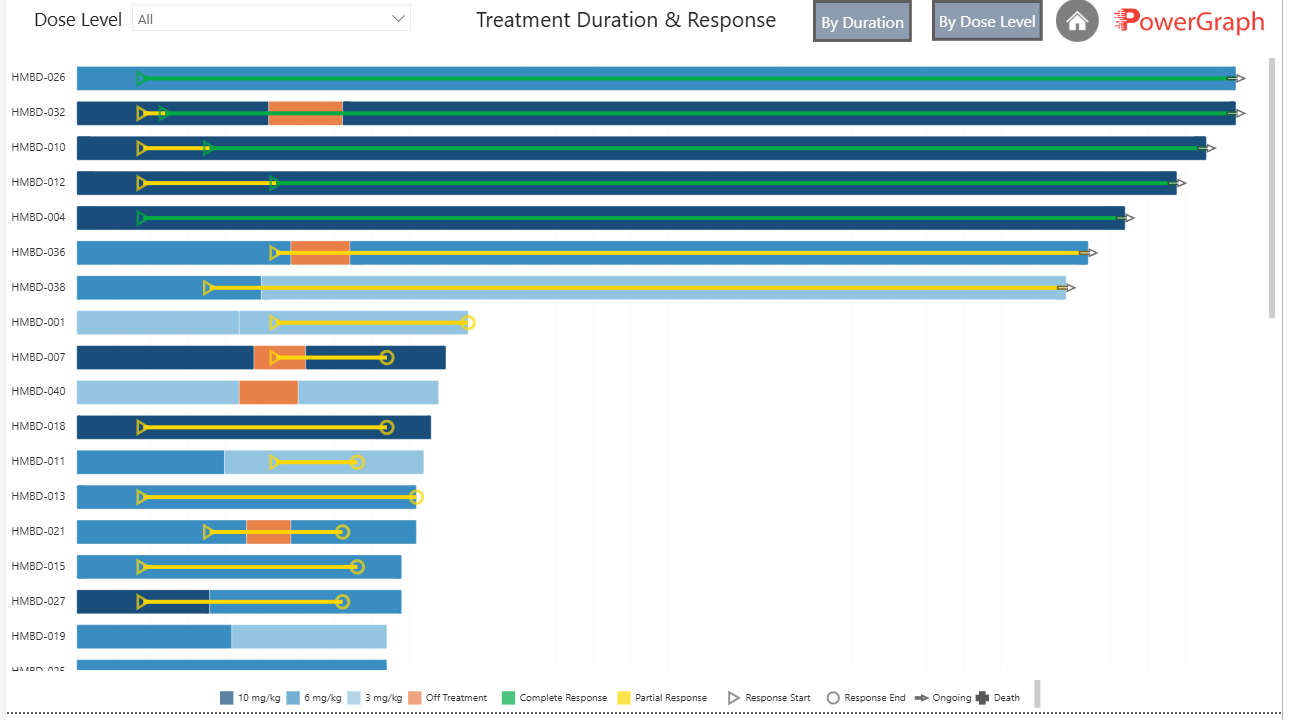
Duration–Response Swimmer Plot
Visualize individual patient treatment durations and responses side by side. Identify responders, track time on treatment, and communicate trial outcomes at a glance.
View in live report →
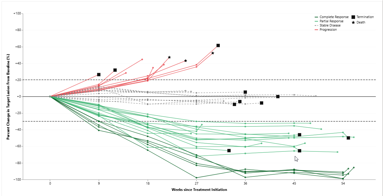
Response By Patient Spider Plot
Monitor individual patient tumor response trajectories over time. Compare across treatment arms and quickly surface outliers that require clinical attention.
View in live report →
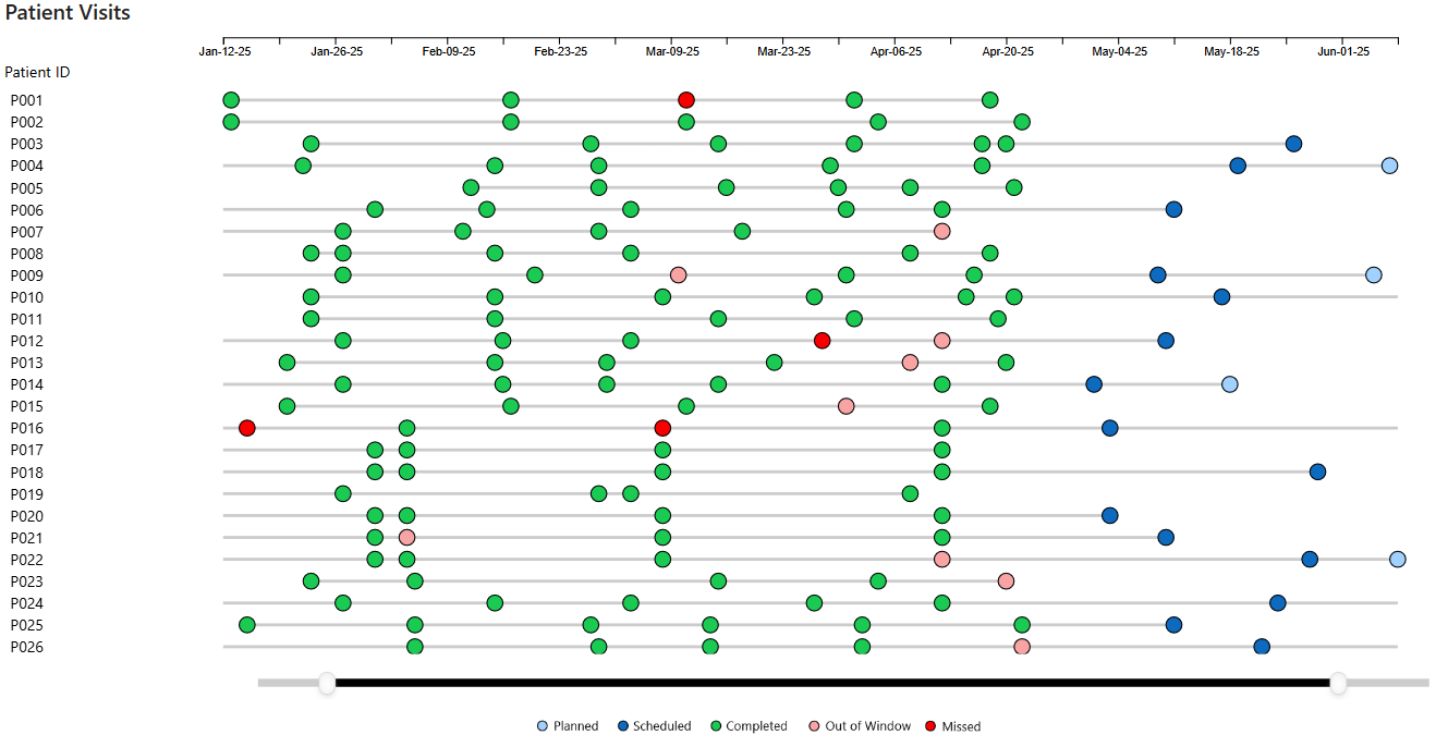
Patient Visits Timeline
Track every scheduled and completed patient visit across your study timeline. Identify gaps in visit compliance, monitor site performance, and ensure protocol adherence at a glance.
View in live report →
Our Clinical Trial Visual Suite
Explore our full suite of Power BI visuals purpose-built for clinical trial reporting.
Patient Response & Safety
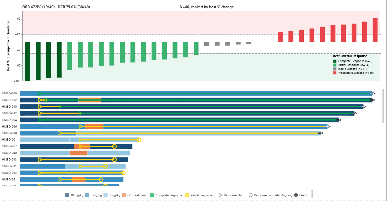
Response Overview
Combined dashboard with cross-filtering between Waterfall and Swimmer plots for a unified view of patient responses.
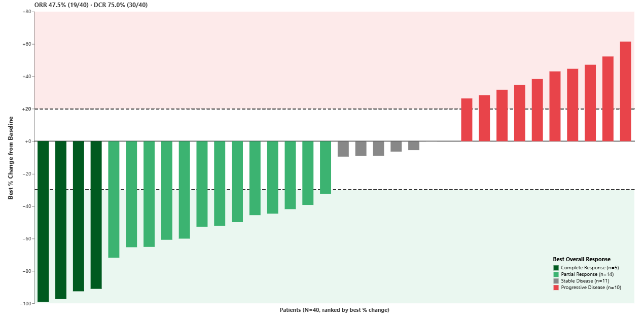
Percent Change Waterfall Plot
Show best percentage change from baseline across the patient population. Quickly identify responders and non-responders at a glance.
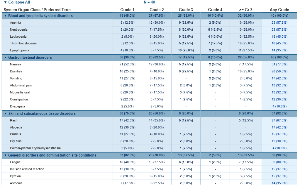
Adverse Events Matrix
Track and categorize adverse events by system organ class across the trial. Identify frequency and severity patterns.
Duration–Response Swimmer Plot
Visualize individual patient treatment durations and responses side by side. Identify responders and track time on treatment at a glance.
Response By Patient Spider Plot
Monitor individual patient tumor response trajectories over time. Compare across treatment arms and quickly surface outliers requiring clinical attention.
Visit & Timeline Tracking
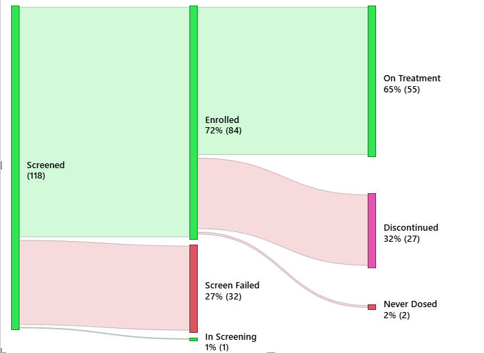
Patient Disposition
Track patient flow through study phases with a Sankey diagram — enrolled, active, discontinued, and completed — in a single view.

Patient Visits Matrix
A comprehensive matrix view of all patient visits across sites and time points. Quickly spot missed visits and compliance gaps across your study.
Patient Visits Timeline
Track every scheduled and completed patient visit across your study timeline. Identify gaps in visit compliance and monitor site performance at a glance.
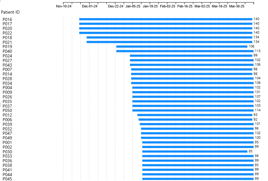
Time on Treatment Timeline
Visualize how long each patient has been on treatment relative to study milestones. Compare across cohorts and identify early discontinuation patterns.
Site Performance
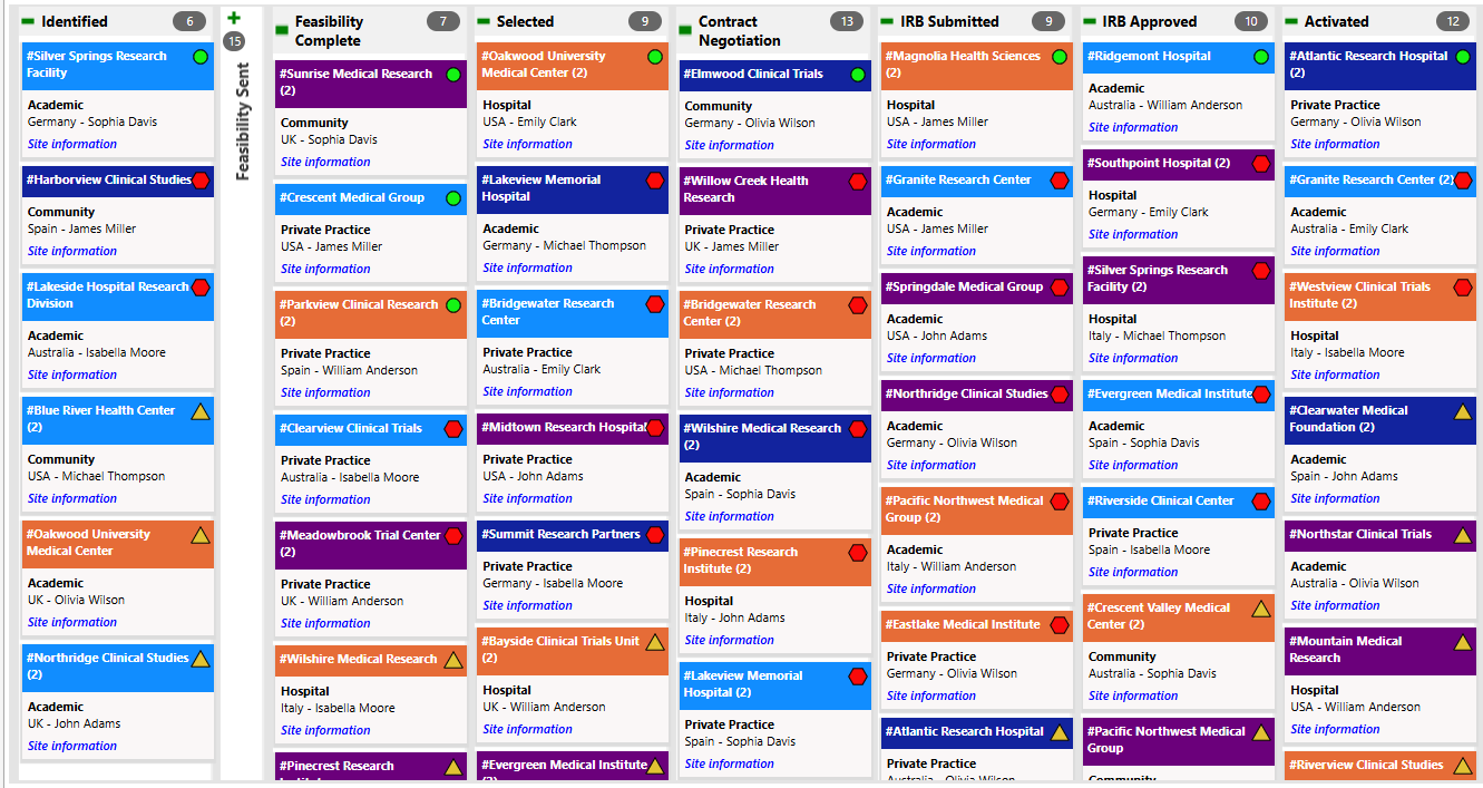
Site Activation Task Board
Monitor site activation progress with a Kanban-style task board tracking each milestone. Identify bottlenecks and keep activations on schedule.
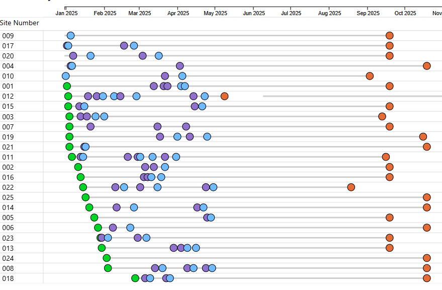
Site Activity Timeline
A Gantt-style view of all site activities showing planned vs actual timelines across your network. Spot delays and reallocate resources proactively.
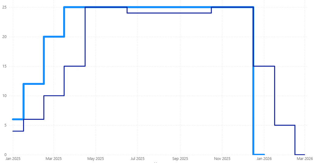
Site Activation Curve
Visualize the pace of site activations over time against your planned activation schedule. Quickly assess whether your study is on track to meet enrollment targets.
Enrollment & Geography
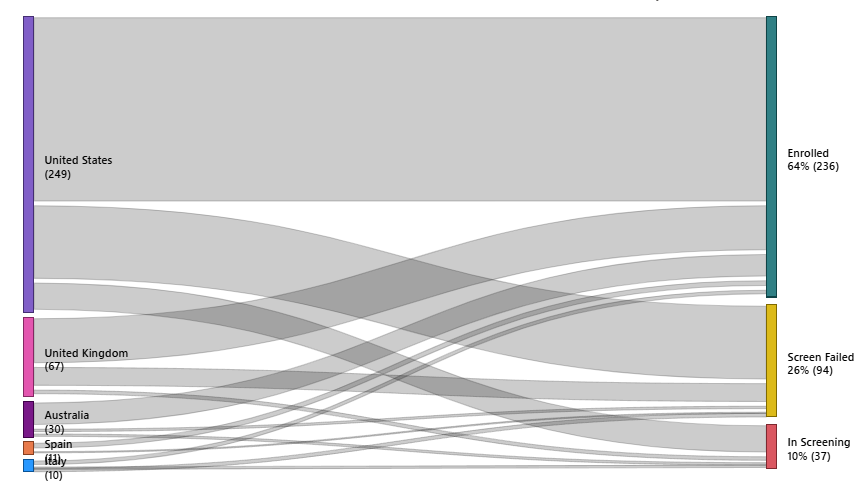
Country – Enrollment Flow
A Sankey diagram showing patient enrollment flows by country, site, and study arm. Identify which regions are driving enrollment and where gaps exist.
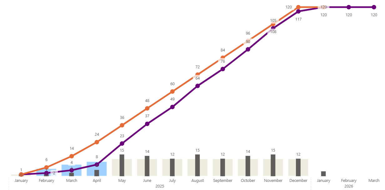
Enrollment Curve
Visualize actual vs projected enrollment over time to identify acceleration or lag early. Keep stakeholders aligned on study progress against targets.
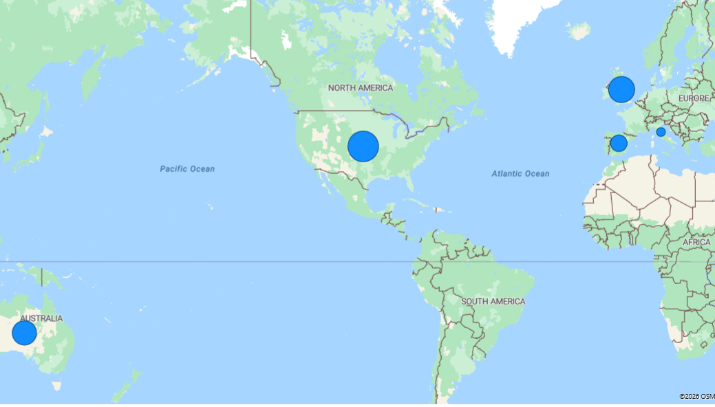
Enrollment Site Map
Geographic view of all active trial sites with enrollment status and performance indicators. Instantly see which sites are meeting targets and which need attention.
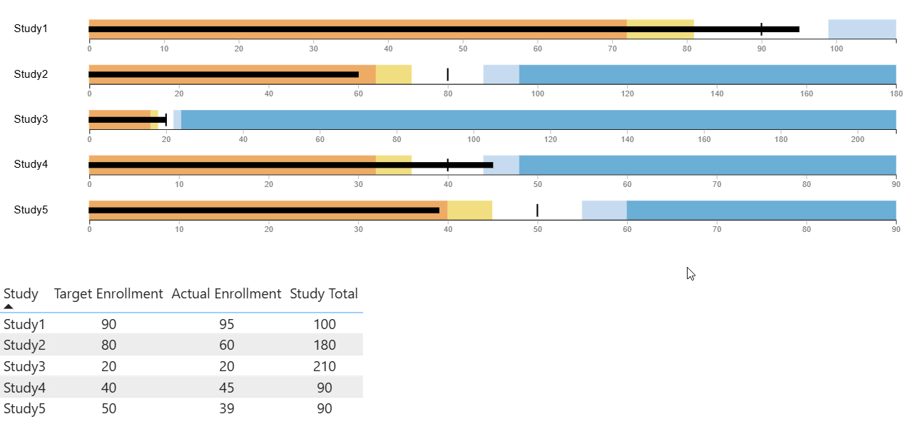
Enrollment Status by Study
Track enrollment progress against targets across all active studies in your portfolio. Compare performance across studies and surface at-risk timelines early.
Elevate Your Clinical Trial Reporting
Discover how PowerGraph can revolutionize your clinical trial data analysis. Schedule a demo to see our custom visuals in action and make data-driven decisions with confidence.