← Back to the Gantt Timeline product page
Gantt Timeline User GuideProject Health Report Configuration
Project Health
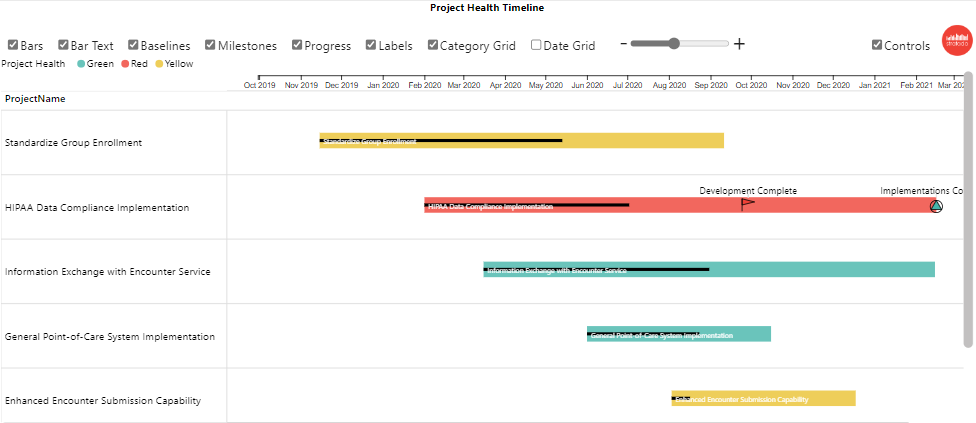
Here, we will show how to configure the “Project Health Timeline” report included in the Sample Reports
In the Power BI sample report on the Timeline tab, click on the Project Health button.
Here are the fields in the order they appear
Parent Category (required)
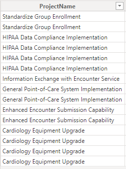
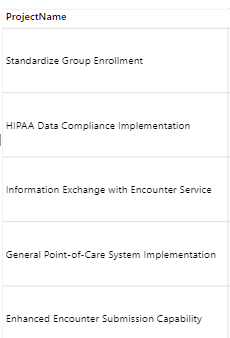
Parent Category defines the rows in the Timeline visual. Multiple fields can be used to display a hierarchy. Our example shows: Project Name From the Excel data file on the Project-Health-Timeline table, we will use Project Name.
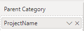
Here is the field in the Parent Category field well:
In the visual the result is:
Timeline Category (required)
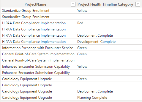
Timeline Category is used to categorize both the Timeline Bars and Milestones and enables the ability to set Timeline Bar color by category, and Milestone color and shape by category. From our sample data we will use the Project Health Timeline Category field.
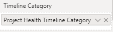
Here is the field in the Timeline Category field well:
Milestone/Task (required)
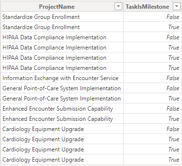
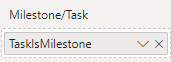
This is a True/False field that delineates between Tasks and Milestones in the data. From our sample data:
Here is the field in the Milestone/Task field well:
Timeline Bar (required)
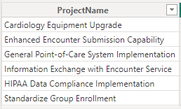
This field supplies the name for each Timeline bar. In many cases this will be the field used for the lowest level of the Parent Category – as in this case, we will use Project Name. Note that the visual will only use the data from the Project Name field when the Milestone/Task field is False:
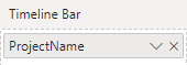
Here is the field in the Timeline Bar field well:
Timeline Bar Text (optional)
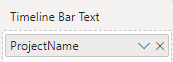
The Timeline Bar Text field enables the display of text in the Timeline Bar. For this example, we will use Project Name:
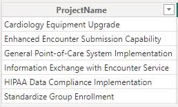
Here is the field in the Timeline Bar Text field well:
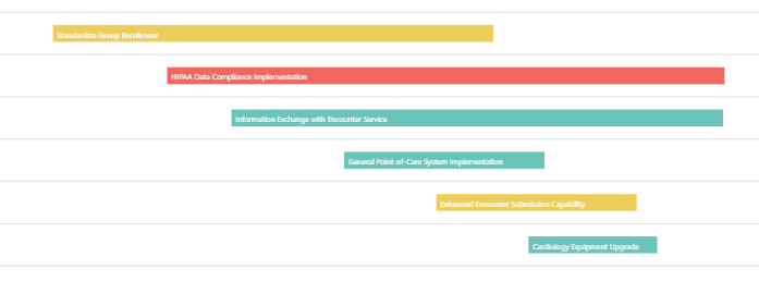
The text can now be rendered in the Timeline bars:
Timeline Bar Start Date, Timeline Bar Finish Date (optional)
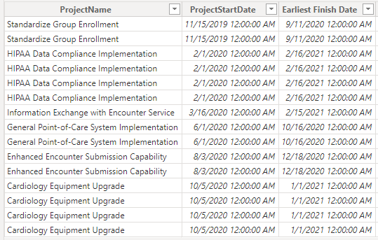
The Timeline Bar Start and Finish dates are used by the Timeline visual to define the Timeline bar display. From the sample data we will use Project Start Date and Earliest Finish Date:
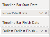
Here is the field in the Timeline Bar Start and Finish Date field wells:
Baseline Bar Start and Finish Dates (optional)
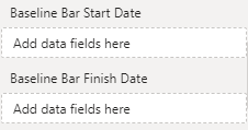
If you have baseline date, these can be used to show baseline bars. In the example, we will not use a baseline dates, so we leave that field well blank:
Milestone
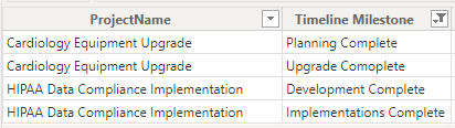
Much like the Timeline Bar field, Milestone is used to name the milestones. Again, in many cases the field in the lowest Parent Category position will be used – as in this case, we use Timeline Milestone. Note that the visual will only use the data from the Task field when the Milestone/Task field is True:
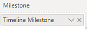
Here is the field in the Milestone field wells:
Milestone Date
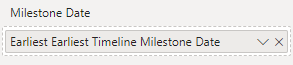
Milestones only need one date, and this is where it’s needed. We will use Earliest Timeline Milestone Date for this field well:
Data Label
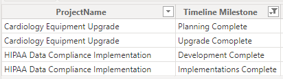
Data labels can be displayed on milestones, timeline bars or both. For this example, we only want to display labels on milestones. Our data has a field called Timeline Milestone which has data for milestones but not for timeline bars (this could also be accomplished through simple DAX):
Here is the field in the Data Label field well:
Sort By
Sort By allows for custom sorting of your data. In the example we will not use a custom sort, so we leave that field well blank:
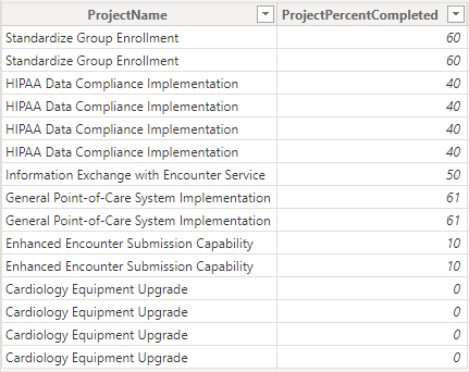
% Completion
Percent completion will display a progress bar inside a timeline bar. From our sample data we will use Project Percent Completed field:
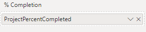
Here is the field in the % Completion field well:
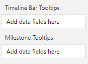
Timeline Bar and Milestone Tooltips
The Tooltips field wells allow you to add one or more fields to be displayed for either Timeline Bars or Milestones. For this example, we will leave them blank: